
A paper floor mat can protect the carpet yet weaken the handover experience. The wrong print choice makes branding unclear, costly, or difficult to repeat.
I choose one-color printing for simple logos and service messages that need strong, repeatable contrast. I choose full-color printing when approved artwork depends on several colors, gradients, or detailed images. I confirm the decision on the final paper construction, not on a screen or generic paper proof.
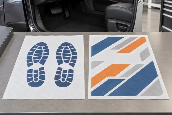
I treat color count as a purchasing decision, not a decoration added at the end. The following process keeps the artwork, mat, quotation, and repeat order aligned.
Which Print Option Fits My Dealership Artwork?
A detailed logo does not always need full color, while a simple design can lose impact when unnecessary colors compete. Guessing increases revisions and approval risk.
I begin with the artwork’s essential visual elements. I use one color for a bold logo, footprint, or short service message. I consider two colors when a second brand accent matters. I use full color only when multiple colors, gradients, or image detail are necessary.
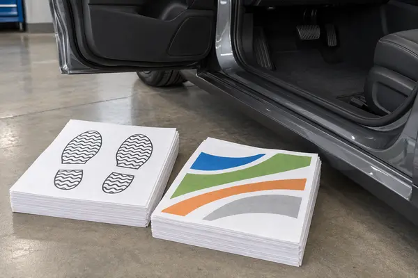
I Choose the Simplest Print That Preserves the Brand
I remove elements that do not help the service customer. Part of the mat may sit under a shoe, so I keep the dealership name, logo shape, and main message easy to recognize.
One-color printing is my starting point for a simple mark. A dark ink on light paper can create clear contrast and gives me one color to approve. I do not assume it is always cheapest because setup, quantity, coverage, and process also affect the quotation.
Two-color printing can preserve a brand accent. I check alignment and contrast on the selected paper. Full color fits artwork that depends on several colors, gradients, or detailed visuals. I avoid it when one clean color communicates the same message.
| My artwork need | My starting option | What I approve |
|---|---|---|
| I use one bold logo or footprint | One color | I approve ink color, contrast, size, and position |
| I need one important accent | Two colors | I approve both colors and their alignment |
| I use gradients or several brand colors | Full color | I approve a production-representative printed proof |
| I use small contact details | I simplify first | I test readability at normal viewing distance |
I compare quotations using the same mat, print area, coverage, quantity, packing, and delivery terms. This isolates the print choice.
How Should I Prepare and Approve the Artwork?
A clean logo can print poorly when the file is low resolution, the safe area is missing, or the buyer and supplier use different color references.
I provide the best available artwork file, define the finished mat size and print area, and mark the required orientation. I approve a layout proof first, then a physical proof made on the intended paper and coating before bulk production.
I Build One Controlled Artwork Package
I send original vector artwork when available. If I use a raster image, I confirm its resolution at final print size. I do not enlarge a small web image. I also outline fonts when appropriate or provide the approved font information.
I include finished dimensions, orientation, print area, margins, and any no-print zone. I keep key content away from edges, folds, and the main heel area. I define which end faces the pedals.
For one-color work, I name the ink reference and state whether the design uses solids, lines, or screened tones. For full color, I request a physical proof because paper shade, coating, and process affect appearance. I use an electronic proof only to check layout.
| My artwork control | What I send or approve | Problem I reduce |
|---|---|---|
| Source file | I send the original vector or suitable high-resolution file | I reduce rough edges and missing detail |
| Finished layout | I mark size, orientation, margins, and print area | I reduce cropping and upside-down artwork |
| Color | I state the approved reference and print option | I reduce vague names such as standard blue |
| Revision | I place a code and date on the approved file | I reduce use of an obsolete logo |
I ask one authorized buyer to approve the final proof. I store the approved file, proof, and revision code together.
How Do I Test Print Quality on the Actual Paper Mat?
A proof can look sharp on coated card but change on thin paper. If I test the wrong substrate, I approve a result the shipment may not match.
I print and test on the intended paper, coating, weight, and finished size. I check color, registration, edges, readability, rub transfer, light moisture exposure, folds, and ink behavior in the expected heel area. I compare each result with the approved physical proof.
I Inspect the Printed Mat as a Working Product
I compare the sample with the approved reference under neutral light. I check solid areas for gaps and inspect alignment where colors meet. I view small text from a normal customer distance.
I place the mat in a representative vehicle and confirm orientation and visibility. I keep it clear of pedals and moving controls. Print position never overrides safe coverage.
I rub a clean dry cloth over printed areas and repeat the agreed light-moisture check. I inspect for transfer or smearing. I fold and stack the sample as specified, then check for offset ink, sticking, or damaged print. These commercial checks make supplier comparisons consistent.
| My inspection point | What I check | My rejection signal |
|---|---|---|
| Overall image | I compare color and layout with the approved proof | I find a wrong revision or obvious visual shift |
| Fine edges | I inspect lines, small text, and color boundaries | I find blurred detail or poor registration |
| Dry rub | I use one repeatable rubbing method | I see unacceptable visible ink transfer |
| Folding and stacking | I use the final pack method | I find offset ink, sticking, or damaged print |
I keep print approval separate from paper performance. My paper weight guide and waterproof mat specification cover those separate decisions.
What Should I Lock Before a Bulk Print Order?
A correct sample can still become a bad reorder when the artwork version, print colors, pack count, or item code changes without a clear approval trail.
I lock the item code, artwork revision, color references, print side, position, paper construction, finished dimensions, proof, quantity, pack count, carton marks, and change-control rule. I require a new approval when any controlled field changes.
I Connect the Printed Proof to Purchasing and Receiving
I create a separate item code for each print option and artwork version. I do not accept a label that says only “paper floor mat.” The code links the product, purchase order, artwork, proof, and packing sheet.
I ask the quotation to separate applicable setup, artwork, plate, proof, or revision charges. I also ask whether an unchanged approved setup can be reused. I do not assume the answer because processes differ.
Before production, I confirm quantity and tolerance. I state pieces per inner pack, packs per carton, total cartons, labels, and destination marks. I focus on quantity accuracy and export-risk reduction because small errors grow across a bulk order.
At receiving, I compare the shipment with the retained sample and latest revision. I check identity, print option, paper, dimensions, image position, color, counts, and damage. I use a raw-material selection process and do not use recycled production waste as substitute material, but I still inspect the finished mat.
| My controlled record | What it identifies | My action when it changes |
|---|---|---|
| Item code | I identify the exact mat and print version | I stop an unapproved substitution |
| Artwork revision | I identify the approved design and date | I request a new layout proof |
| Physical proof | I identify the accepted print on final paper | I compare production before acceptance |
| Change record | I identify any material, color, size, or process change | I restart the required approval step |
I choose the simplest print that preserves the brand, prove it on the final paper mat, and keep that proof linked to every purchase and reorder.